| Entrance | Mainstreet | Wiki | Register |
|
# of watchers: 1
|
Fans: 0
| D20: 3 |
| Wiki-page rating |  Stumble! Stumble! |
| Informative: | 0 |
| Artistic: | 0 |
| Funny-rating: | 0 |
| Friendly: | 0 |


2006-03-13 [Estantia]: and the centering once more hates me...
2006-03-14 [moira hawthorne]: if you have line spaces the center tag will break up... either open and close it all the time... or use *** between sections...
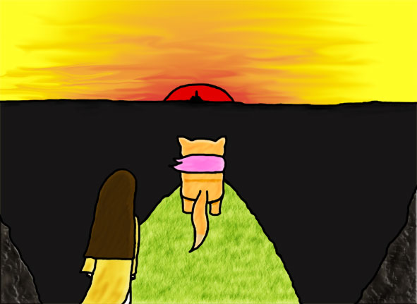
2006-03-14 [moira hawthorne]: and your image is 591px width... if it is 500 it wouldnt make a big space from the top to the end of the banner... you dont have to reload it just tag it <img500:
2006-03-14 [moira hawthorne]: [flat bowl of land was cast into deep shadow by the fat red-gold sun half over the horizon. From the black expanse of the land the spires of a single black city stabbed upwards to be silhouetted against the sunset.] ... there be a glow of set set on the land at the farther horizon so the the distance horizon and the sky blend and fuzz/blurr together and are not a sharp line...
2006-03-14 [moira hawthorne]: other than that it is great.. love the sky and the writing is good
2006-03-14 [Estantia]: yes, i put in center tags for each and it complained... The image itself I'd rather have bigger than smaller. Still uncertain about what you mean by the fuzz though...
2006-03-14 [moira hawthorne]: it will always show you a missing tag...
2006-03-14 [moira hawthorne]: the difference is barely anything... between 591px and 500 px
2006-03-14 [moira hawthorne]: the horizon is never clear... its call atmospheric perpsective... things it the distance become blurry ... so the sky line and earth curve away is never a crisp line of high contrast... and at sunset this effect is exagrated... because of the lower light levels... so unless it is near by buildings or tree line... and that means the close to mid distance you are not going to get a crisp line between earth and sky... and here in this painting the horizon is the very very far distance... so very blurry... and b/c it is sunset the colours of the sky are going to be on the ground.. refective colour and light.
2006-03-14 [Estantia]: I see, but there is quite a crisp one because it's a bowl, not a flat area it's slightly concave so the light hit below where you are... it does work, no idea how to explain it though...
2006-03-14 [moira hawthorne]: even so the rules still apply
2006-03-14 [Estantia]: they do... and I did try.... stupid burn tool makes a really obvious line though, which is NOT what I wanted... and there really isn't that much between them and the coast, maybe a bit of forest but really relatively empty
2006-03-14 [moira hawthorne]: you want me to do it?
2006-03-14 [Estantia]: nah... don't spend your valuable time on it... I quite like it as is but I may yet do something...
2006-03-14 [moira hawthorne]: want a cool trick that would look really good..... copy the sky paste it back flip it vertically ... so it is like a reflection... compress it to about a cm put that over the horizon and blurr it abit... use the eraser tool to make the city a silolette...
2006-03-15 [Estantia]: but there's no sea... so it wouldn't reflect.
2006-03-15 [moira hawthorne]: land refects... I didnt say sea...
2006-03-15 [Estantia]: land wouldn't felect that clearly I don't think....
2006-03-15 [moira hawthorne]: no not clearly but it does...
2006-03-15 [Estantia]: I don't suppose you have an example photo?
2006-03-15 [moira hawthorne]: photos are different than paintings... b/c painting creat what you see and camera take different effects... I also dont have a tonnes of photos to choose from at my disposial... but there something simular on [Lordterrex]'s house... just the camera exagated the lens flare of the sun... and the ground isnt in as much shadow b/c itnot as much of a drop away bowl....
2006-03-16 [Estantia]: i see what you mean, but it would still be quite dark because snow's also much more reflective.
2006-03-16 [moira hawthorne]: yes you put on multiple layer... and blur and earse it to look pleasing..
2006-03-16 [Estantia]: that might work... as most of the details are either rocks or grass, maybe some forest, it doesn't particularly help...
2006-03-16 [moira hawthorne]: basically what you dont want is a sharp high contrast line in the far distance
2006-03-16 [Estantia]: heh, that was the main idea of the piece...
Number of comments: 26 | Show these comments on your site |
|
Elftown - Wiki, forums, community and friendship.
|